Card View
Overview
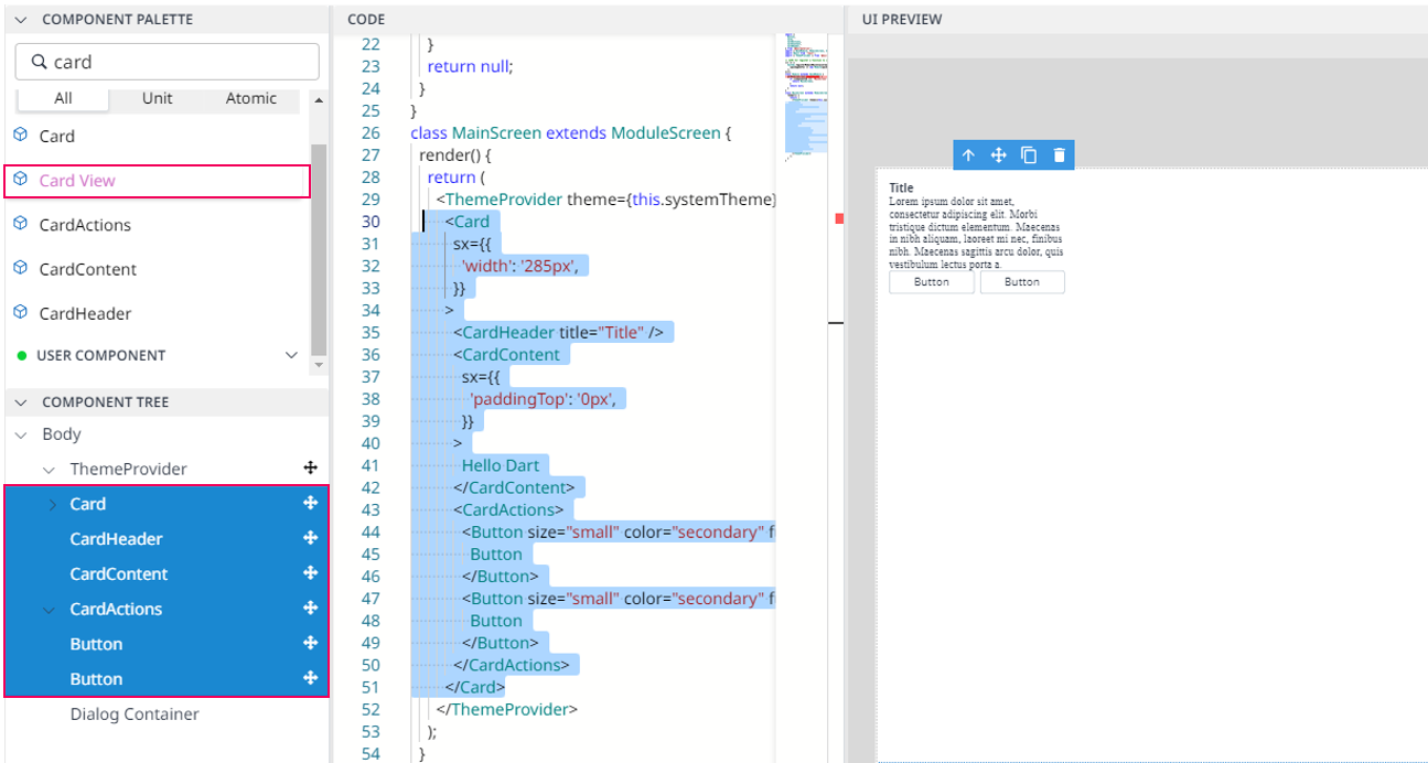
Card View organizes content into a grid of cards. The primary usage of CardView is that it helps to give a rich feel and good looking to the UI design in a way that is not visually overwhelming.
Card View consists of Card, CardHeader, CardContent, CardAction, and two Button. You can add more basic components in order to make your design look better.

Import
import {
  Button,
  Card,
  CardActions,
  CardContent,
  CardHeader,
} from '@mui/material';
The above source will be imported automatically after dragging and dropping the Basic Component to the UI Preview Panel.
Code Sample:
<Card
          sx={{'width': '285px',}}>
      <CardHeader title="Title" titleTypographyProps={'[object Object]'} />
      <CardContent
            sx={{'paddingTop': '0px',}}>Hello, welcome to Dart-Suite
        </CardContent>
      <CardActions>
          <Button
              size="small"
              color="secondary"
              fullWidth={true}
              sx={{'color': 'dark blue',}}>Discover</Button>
            <Button size="small" color="secondary" fullWidth={true}>Help</Button>
        </CardActions>
</Card>
