Basic Components
What is the Basic Component?
Basic Component (Basic Component) is a type of UI component used in Dr.Dart-IDE. All the components are essential but have simple functions. An example is, such as the Table, Box, Divider, Checkbox, etc. Basic Component is the default appearance on IDE, and you can drag & drop Basic Component into UI Preview without coding.
Basic Components Type
The Basic Component list of Dart-IDE is largely divided into UNIT and ATOMIC types, as shown below.
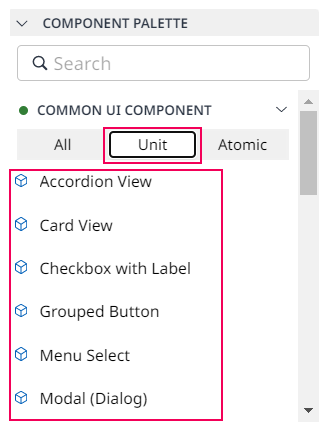
ATOMIC is the most basic unit of UI Component, and the UNIT is a combination of ATOMIC Components.
Type | Explanation | |
|---|---|---|
ATOMIC | The most basic unit of Material UI Component | 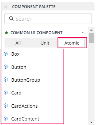 |
UNIT | Combination of Atomic components frequently used in UI screen composition ※ However, it is only a combination of ATOMIC components, not a separate component unit.
CODE
|  |
Articles
How to use Basic Component?
Then, there are some steps you can follow to use Basic Component quickly.
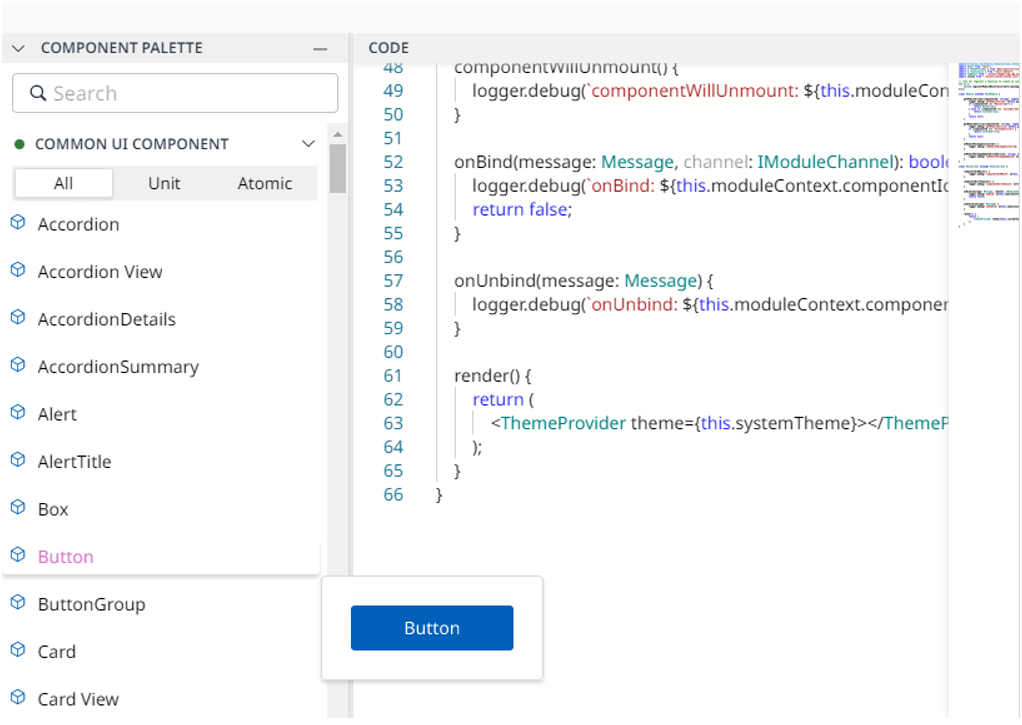
Step 1: Open DART-IDE, then choose Basic Component in the COMPONENT PALETTE panel.

Step 2: Drag & drop the Basic Component that you want from the COMPONENT PALETTE panel into the UI PREVIEW panel.
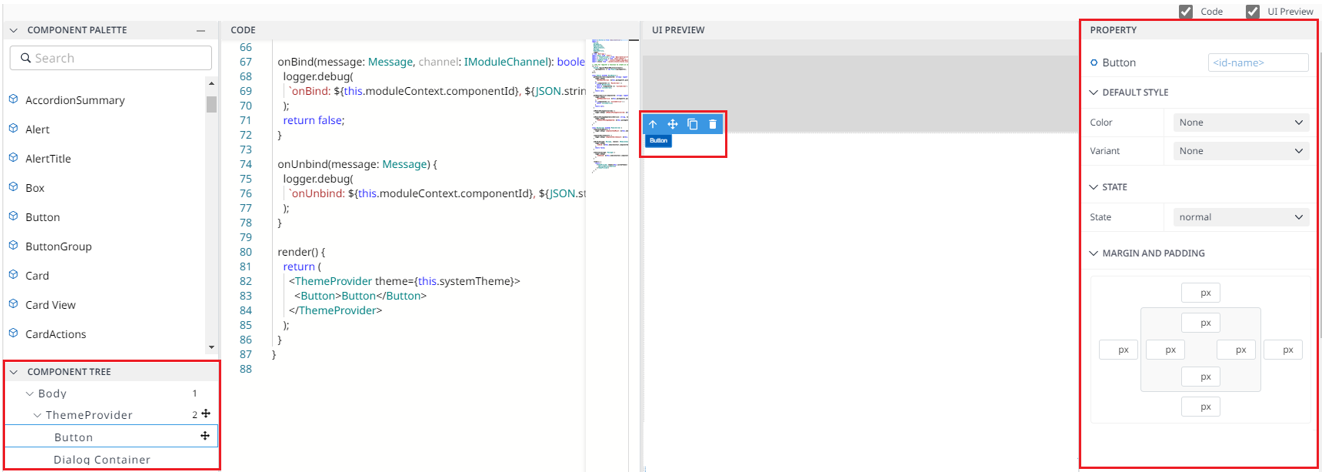
After dragging and dropping progress, the UI PREVIEW will display the corresponding Basic Component layout.
Also, the source code of this Basic Component will be generated automatically into the CODE EDITOR.
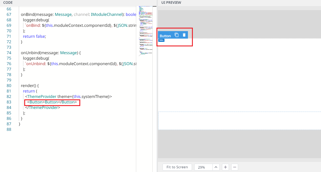
Step 3: Click the Basic Component in the UI PREVIEW panel to view:
PROPERTY panel on the right side.
Its child components are in the COMPONENT TREE panel on the left side.
You can change its properties from the Property panel or source code in Code Editor.
