Grouped Button
Overview
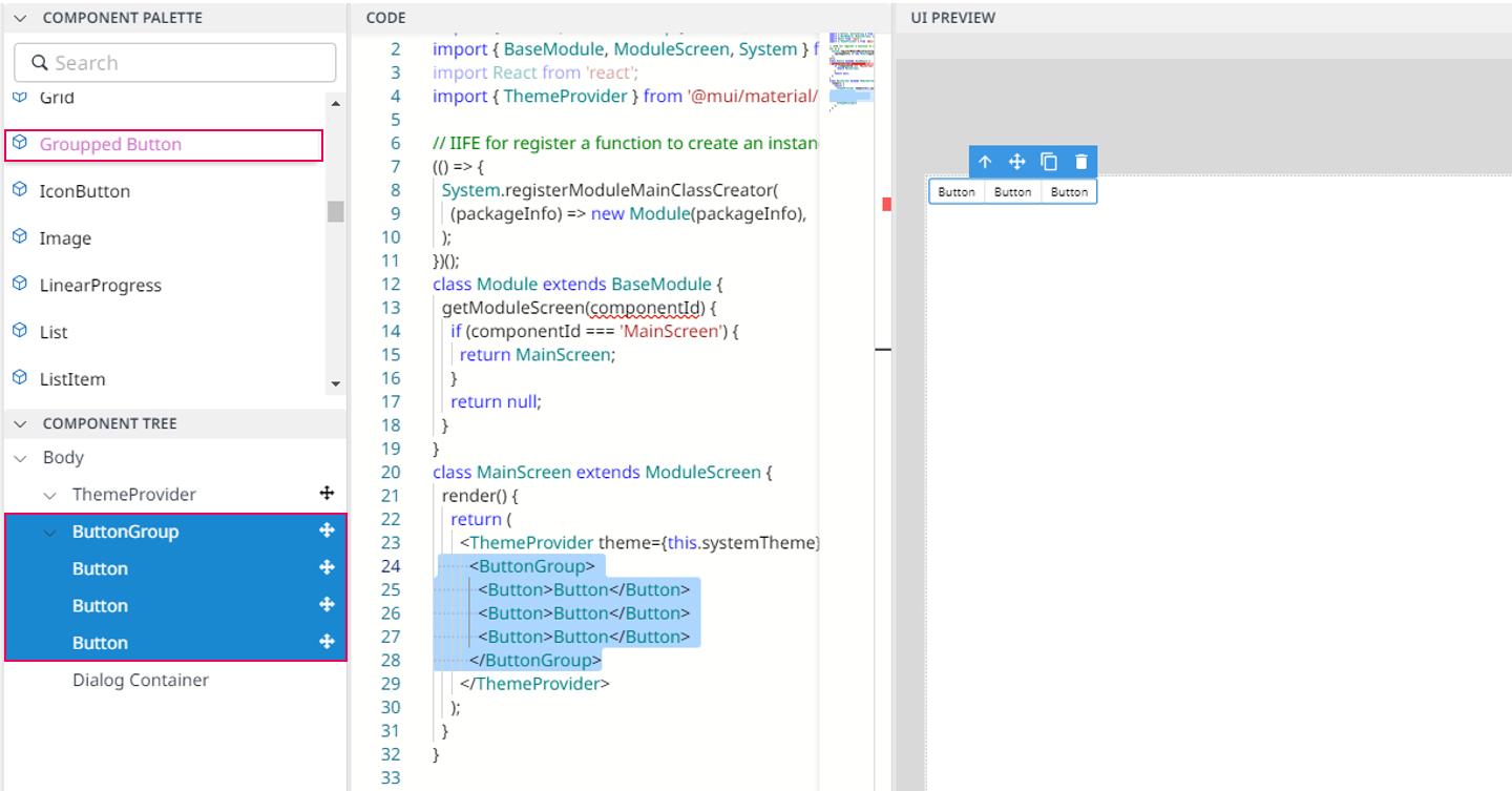
Grouped button wraps a series of Button together into a single line with the ButtonGroup. When you drag & drop Grouped Button, UI Preview will appear as a group of three buttons. You can add more than three buttons if you want, then adjust each button in the Property panel.

Import
import { Button, ButtonGroup } from '@mui/material';The above source will be imported automatically after dragging and dropping the Basic Component to the UI Preview Panel.
Code Sample:
<ButtonGroup>
      <Button color="primary">Page 1</Button>
      <Button color="secondary">Page 2</Button>
      <Button color="success">Page 3</Button>
</ButtonGroup>
