Toast
Overview
Toast presents brief feedback on an operation in a popup window. The message is only filled to the extent necessary, and the ongoing activity is still visible and interactive. After a timeout, toasts disappear by themselves.
Toast consists of Alert, AlertTitle, Button, IconButton, Snackbar, SnackbarContent.
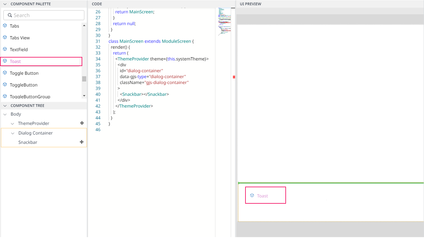
To use Toast component, you should drag & drop Toast at the bottom of UI Preview.

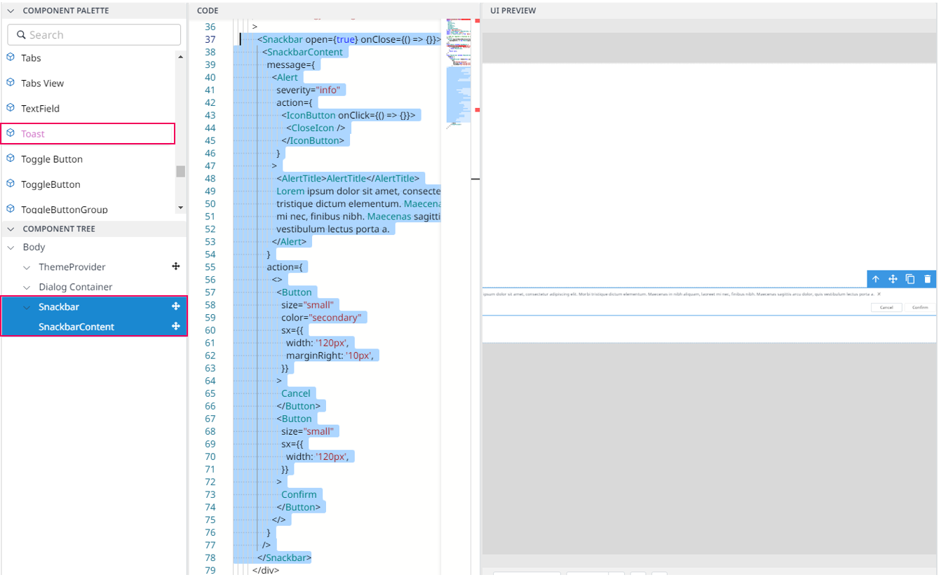
Then, the result is as follows:

Import
import CloseIcon from '@mui/icons-material/Close';
import {
  Alert,
  AlertTitle,
  Button,
  IconButton,
  Snackbar,
  SnackbarContent,
} from '@mui/material';
The above source will be imported automatically after dragging and dropping the Basic Component to the UI Preview Panel.
Code Sample:
<Snackbar open={true} onClose={() => {}}>
    <SnackbarContent message={
          <Alert severity="info"
                 action={
                 <IconButton onClick={() => {}}>
                      <CloseIcon />
                 </IconButton>}>
                 <AlertTitle>Do you want to log out?</AlertTitle>
          </Alert>}
                 action={<>
                  <Button size="small"
                          color="secondary"
                  sx={{width: '120px',
                       marginRight: '10px',}}>
                    Cancel
                  </Button>
                  <Button
                    size="small"
                    sx={{width: '120px',}}>
                    Confirm
                  </Button>
                  </}
                    sx={{'top': '20px',
                         'right': '20px',
                         'bottom': '20px',
                         'left': '20px',}}/>
</Snackbar>
