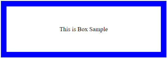
Box
Overview
The Box component serves as a wrapper component for most of the CSS utility needs. Furthermore, Box mainly comprises margins, borders, padding, and content. It would help if you understand how the box model functions in order to accurately configure an element's width and height across all browsers.

Please refer to this for more information: https://mui.com/material-ui/react-box/.
Import
import { Box } from '@mui/material';The above source will be imported automatically after dragging and dropping the Basic Component to the UI Preview Panel.
Property
Property:
Name | Default | Description |
Id-name | Placeholder: <id-name> | The Id-name of the created component. |
State | State: Normal | The State of the created Component. |
Margin and Padding | Size Unit: Px | The component size of Margin and Padding with many selectable Size Units. |
Size | The component Size of Width and Height with many selectable Size Units. | |
Layout | Position: None Size Unit: Px | The component Layout includes Position and Top - Right - Bottom - Left with many selectable Size Units. |
Text | Font-family: None Font-weight: None Text-align: Left Size Unit: Px | The component Text includes Font-family, Font-size, Font-weight, Font-color, Text-align. |
General | Visibility: None Opacity: 100% | The component General includes Visibility, Opacity, and Background. |
Advanced Style | The component Advanced Style includes Classname and Inline Style addition. |
Code Sample
 <Box component="span" sx={{ p: 2, border: '1px dashed grey' }}>
      <Button>Save</Button>
  </Box>