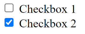
Checkbox
Overview
An input control known as a Checkbox enables users to choose one or more selections from a wide range of choices. Not only can the users select one or more items from a set using checkboxes, but a checkbox can also be utilized to switch on or off an option.

Please refer to this for more information: https://mui.com/material-ui/react-checkbox/.
Import
import { Checkbox } from '@mui/material';The above source will be imported automatically after dragging and dropping the Basic Component to the UI Preview Panel.
Property
Property:
Name | Default | Description |
Id-name | Placeholder: <id-name> | The Id-name of the created component. |
State | State: Normal | The State of the created Component. |
Margin and Padding | Size Unit: Px | The component Margin and Padding with many selectable Size Units. |
Size | Size Unit: Px | The component Size of Width and Height with many selectable Size Units. |
Layout | Position: None | The component Layout includes Position and Top - Right - Bottom - Left with many selectable Size Units. |
Icon | Default: Enabled Checked: Disabled Indetermined: Disabled | The component Icon includes Default, Checked, and Indetermined. |
Title | Font-family: Noto sans Font-weight: Normal Text-align: Left Size Unit: Px | The component Text includes Text, Font-family, Font-size, Font-weight, Font-color, Text-align. |
General | Disabled: false Checked: false Indetermined: false Opacity: 100% | The component General includes Disabled, Checked, Indertermined, Opacity, and Background. |
Advanced Style | The component Advanced Style includes Classname and Inline Style addition. |
Code Sample:
<FormControlLabel
  label="Parent"
  control={
    <Checkbox
      checked={checked[0] && checked[1]}
      indeterminate={checked[0] !== checked[1]}
      onChange={handleChange1} />}/>