Skip table of contents

Drag/Drop Block to Visual Scripting

This page guides you on how the different node types are generated and its structures.

Before going to Node Structure, you need to read through this:

  • Logic Component, Read & Write Data Component and API Component of Component Palette can be dragged and dropped only into Visual Scripting panel directly.

  • Basic Component and User Componentcan be dragged and dropped only into UI Preview directly.

  • Exception: Data Mapping Component of Read & Write Data Component is the only exception that can be dragged and dropped into UI Preview, not Visual Scripting panel.

To understand details which components can be dragged and dropped into UI Preview or Visual Scripting, refer to below table:

Component Type

UI Preview

Visual Scripting

Basic Component

Available

Not available

User Component

Available

Not available

Logic Component

Not available

Available

Read & Write Data Component

Not available

Available

API Component

Not available

Available

Exception: Data Mapping Component (Read & Write Data Component

Available

Not available

Node Structure

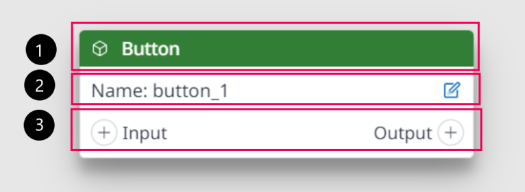
Basic Component Node

Basic Component Node

1

  • Left icon: refer to image above.

  • Title: Name property of the corresponding BC component in the Property panel.

  • Background color code: #327E36 (Light mode/Accent/Green)

2

  • Name: A label that comes with Edit icon. Default value is <id-name> which is same with the Property panel.

3

  • Shows action of component: Default show (+) Input and Output (+) button 


User Component Nodee

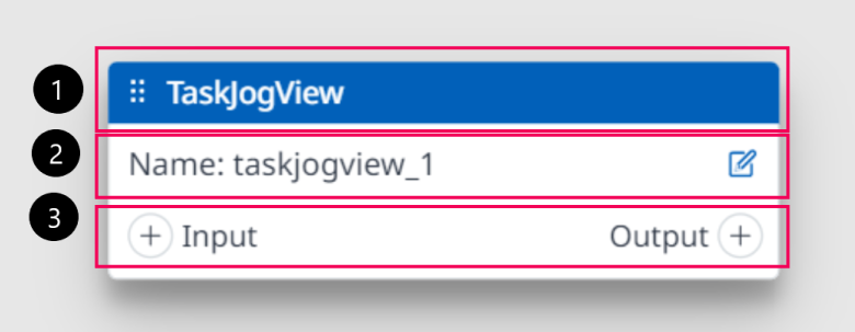
User Component Node

1

  • Left icon: Refer to image above.

  • Title: Name property of the corresponding UC component in the Property panel.

  • Background color code: #0160B9 (Light mode/Primary/normal).

2

  • Name: A label come with Edit icon. Default value is <id-name> which is same with the Property panel.

3

  • Show action of component: Default show (+) Input and Output (+) button.

Logic Component

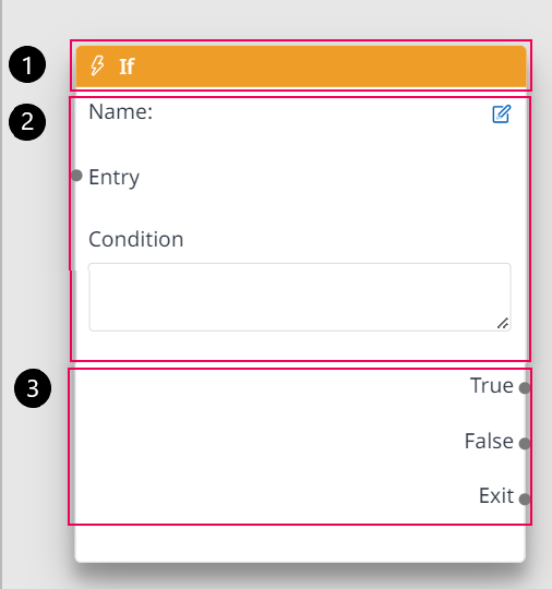
Logic Component

1

  • Left icon: Refer to image above.

  • Title: Name property of the corresponding Logic component in the Property panel.

  • Background color code: #EE9D28(Light mode/Accent/Orange 02)

2

  • Name: A label come with Edit icon. Default value is <id-name> which is same with the Property panel. (The ID of the Node is displayed as the Name of the Node.)

  • Entry Port

  • Condition: allow user to enter needed conditions for

3

  • Output

Header, Body, Footer will change according by Logic Node type.

Read & Write Data Component
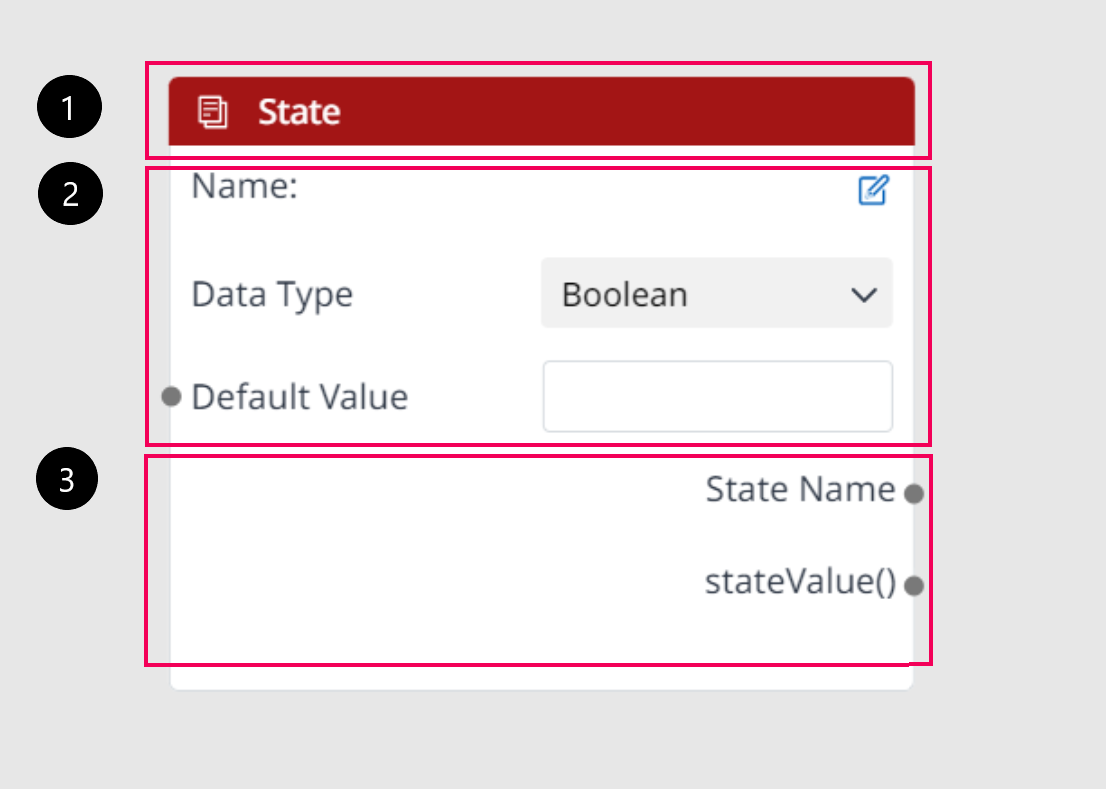
Read & Write Data Component

1

  • Left icon: Refer to image above.

  • Title: Name property of the corresponding Read & Write Data component in the Property panel.

  • Background color code: #A31515 (Light mode/Accent/Red 04)

2

  • Name: A label come with Edit icon. Default value is <id-name> which is same with the Property panel. (The ID of the Node is displayed as the Name of the Node.)

  • Default value: Blank.

3

  • Output (optional)

Header, Body, Footer will change depending on Read/Write Node type.

API Component
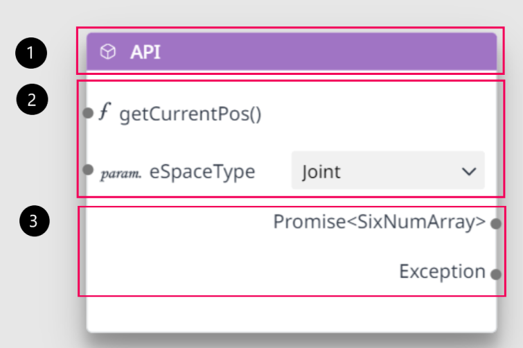
API Component

1

  • Left icon: Refer to image above. It will change depending on block type.

  • Title: Name property of the corresponding API component in the Property panel.

  • Background color code: #A074C4(Light mode/Seti/Purple)

2

  • Name:

    • API function name: The icon is not changed; Name of each API will fix according by API block when drag & drop into Visual Scripting Panel

    • API input:  It will change depending on API Block.

3

  • API Output: It will change depending on API Block.

JavaScript errors detected

Please note, these errors can depend on your browser setup.

If this problem persists, please contact our support.