FormControl
Overview
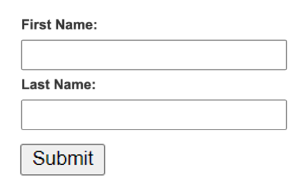
FormControl is a user interface control that serves as the point of connection between the user and the server, such as text fields, buttons, checkboxes, range controls, or color pickers. Therefore, FormControl is simply a key-value pair API for pinging the server back and forth.

Please refer to this for more information: https://mui.com/material-ui/api/form-control/.
Import
import { FormControl } from '@mui/material';The above source will be imported automatically after dragging and dropping the Basic Component to the UI Preview Panel.
FormControl would be generated automatically after Checkbox with Label is dragged and dropped.
Property
Property:
Name | Default | Description |
Id-name | Placeholder: <id-name> | The Id-name of the created component. |
State | State: Normal | The State of the created Component. |
Margin and Padding | Size Unit: Px | The component Margin and Padding with many selectable Size Units. |
Size | Full-width: false Size Unit: Px | The component Size includes Full-width, Width, and Height with many selectable Size Units. |
Layout | Position: None Size Unit: Px | The component Layout includes Position and Top - Right - Bottom - Left size. |
General | Disabled: False Required: False Error: False Visibility: None Opacity: 100% | The component General includes Disabled, Required, Error, Visibility, Opacity, and Background. |
Advanced Style | The component Advanced Style includes Classname and Inline Style addition. |
Code Sample:
<FormControl
          sx={{':active': {
              'width': '150px','height': '200px',
              'position': 'static','top': '10px','right': '15px','bottom': '20px','left': '20px',
              'visibility': 'visible',},}}>
</FormControl>
Only after FormControl first gets established, then FormLabel, FormControlLabel, and FormGroup could be created accordingly.
Related Components
