Properties
You will find DART-IDE very helpful as a user because of the Properties panel's various practical advantages. This document will give you a quick understanding of these properties by providing the following information about each property:
Properties Panel: Display each property in the Properties panel that allows adjusting on the right side of the screen.
Code Sample: Each property's code is generated automatically after dragging and dropping a component into UI Preview.
If you type code for Basic Component in Code Editor, the corresponding value will reflect in the Properties panel. Also, changing the properties of each Basic Component will auto-generate the corresponding code into Code Editor.
1. ID-Name
This property using for specifies a name for a component in IDE. When you drag and drop an item from Component Palette, Id-name is not automatically assigned. You can selectively give the value when you want to apply the id property value.
It helps you create a unique name for a chosen component that can easily differentiate from the others in Source Code.
For example, the first button component can be named "Button1" by the user, and then the second button component gets the name "Button2" so that the other user can identify them quickly on Sources Code if needed.
Properties Panel:

Code Sample:
<Accordion id="Accordion1"></Accordion>2. Title
This property using for specifies the title of the current chosen component.
Properties Panel:

Code Sample:
<CardHeader title="Title1"></CardHeader>3. Default Style
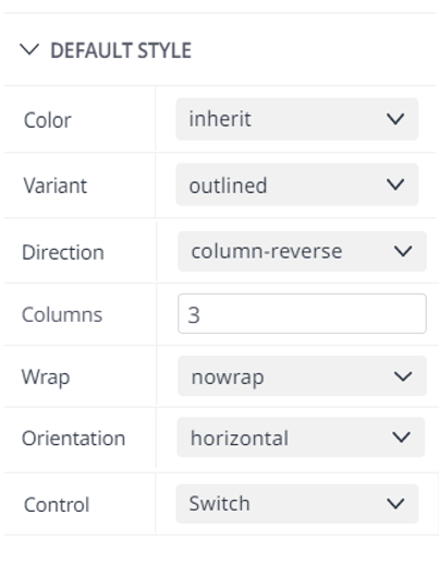
Depending on the perspective needed for the default, The property ranges that each component provides are all different, and even though they have the same property, the value range can differ.
For example, for the color property, most components usually provide primary, secondary, error, warning, info, and success as their values, but when it comes to <Slider> Component, primary and secondary are provided as color property values. Also, some components cannot have color properties.
Properties Panel:
These are default values set up already by IDE. It is based on particular needs so that you can choose and update the style which fits your demands.
No | Name | Component | Code Sample | Values |
1 | Color | Button |
CODE
| inherit primary secondary success error |
ButtonGroup |
CODE
| inherit primary secondary success error | ||
CircularProgress |
CODE
| inherit primary secondary success error | ||
LinearProgress |
CODE
| none inherit primary secondary | ||
Radio |
CODE
| none default primary secondary success | ||
Slider |
CODE
| none primary secondary | ||
Switch |
CODE
| none default primary secondary success | ||
ToggleButtonGroup |
CODE
| none standard primary secondary success | ||
ToggleButton |
CODE
| none standard primary secondary success | ||
2 | Severity | Alert |
CODE
| none success error info warning |
3 | Variant | Button |
CODE
| contained outlined text longPressed |
ButtonGroup |
CODE
| none contained outlined text | ||
CircularProgress |
CODE
| none indeterminate determinate | ||
LinearProgress |
CODE
| none buffer indeterminate determinate query | ||
Tabs |
CODE
| none fullWidth scrollable standard | ||
Typography |
CODE
| none body1 body2 button caption | ||
4 | Direction | Grid |
CODE
| none column-reverse Column row-reverse row |
Stack |
CODE
| none column-reverse Column row-reverse row | ||
5 | Column | Grid |
CODE
| |
6 | Wrap | Grid |
CODE
| none nowrap wrap-reverse wrap |
7 | Orientation | ButtonGroup |
CODE
| none horizontal vertical |
Slider |
CODE
| none horizontal vertical | ||
Tabs |
CODE
| none horizontal vertical | ||
8 | Control | FormControlLabel |
CODE
| checkbox switch radio |
4. State
States inform the user of the status of UI elements. Each state must have distinct affordances that set it apart from the others and the surrounding layout while maintaining visual similarity and avoiding significant component changes.
A representative state property would typically have five options: Normal - Hover - Active - Focus - Visited
After you choose the kinds of state, you need to select types of Size and fill in such as Margin or Padding or Size Properties in PROPERTY Panel so that you can use State property.
Properties Panel:

Code Sample:
<Accordion sx={{ ':Active': {'marginTop': '150px' }}} ></Accordion>5. Margin and Padding
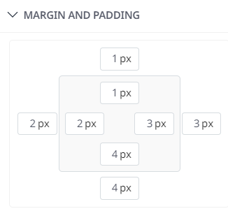
Using the Margin and Padding property, you may quickly change the height/length of the component inside-out in the tricky locations on the screen. You can select a unit with an adjustable height/length to meet the situation. You will have various options to update and alter the margin and padding from left to right and from top to bottom, depending on multiple circumstances, to meet your needs.
Properties Panel:
Code Sample:
<Accordion
         sx={{ ':active': {'margin': '1px 3px 4px 2px',
                          'padding': '1px 3px 4px 2px'}, }}
</Accordion>
You can choose the types of size unit by a dropdown beside the number with five different size units: Px, %, Em, Rem, VW
6. Size
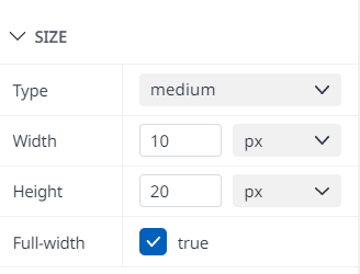
For this property part, the system would allow you to fix the Width and Height of Chosen Component. Depending on your needs, it can be selected and filled in with many size units.
In this Size property, the system would let the user adjust the value of the fourth properties: Type, Width, Height, and Full-width selections.
Properties Panel:
Code Sample:
<ButtonGroup
          size="medium"
          sx={{ 'width': '10px', 'height': '10px' }}
          fullWidth={true}
></ButtonGroup>
7. Alignment
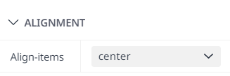
In this property Alignment, we have developed Align-items for a suitable component such as ListItem. The Align-items property specifies the default alignment for items inside the flexible container.
Align-items has three values: None - Center - Flex-Start to fit the user's needs.
Properties Panel:
Code Sample:
<ListItem alignItems="center">8. Layout
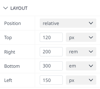
For this property, you can be flexible in choosing which types of Positions are needed. Additionally, the system might use the five types mentioned above to let you fix Top, Right, Bottom, and Left properties.
Depending on which types of tasks the user needs to resolve, the IDE properties panel offers the Position with five kinds of Positions required: None - Relative - Static - Fixed - Absolute.
Properties Panel:
Code Sample:
<Accordion
          sx={{ 'top': '120px', 'right': '200rem', 'bottom': '300em', 'left': '150px',
              'position': 'relative' }}>
</Accordion>
9. Source
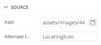
In this part, the Source property would appear when you select and drop Image into UI Preview. After that, you can choose an image file from many sources from your computer or other sources that you need to import into IDE Codes.
To use this property, you should import by the File-uploading Button on the right side of Path. Then, you can choose a file and set up Alternate Text for the image you imported.
Properties Panel:
Code Sample:
<img alt="LocatingIcon" src={ Icon44334Copy}/>10. Values
When you come to this property, there are many textboxes in each property that you can set up the value, defaultValue, or furthermore, you can build from max value to min value of the Basic Component whenever you need.
Properties Panel:
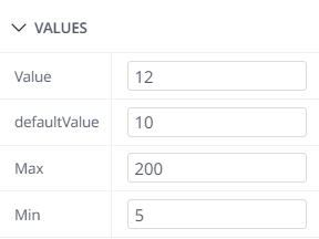
Code Sample:
<Slider value={12} defaultValue={10} max={200} min={5}></Slider>11. Text
You can type text into the Text Input through the button's text property. Similarly, you may select the
Font-family
Font-weight
Font-size
Font-color
You may directly change the Text-alignment on this property section.
Properties Panel:
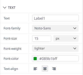
Code Sample:
 <ButtonGroup
              size="medium"
              sx={{'width': '10px',
                  'height': '10px',
                  'fontFamily': 'Noto-Sans',
                  'fontSize': '15px',
                  'fontWeight': 'lighter',
                  'color': '#089b1bff',
                  'justifyContent': 'center'}}
               fullWidth={true}
               label="Label1"">
  </ButtonGroup>
12. Label
Similar to the Text property, the Label property will also have many properties supporting Label like
Font-Family
Font-Weight
Font-Size
Text-align
Font-Color
Label-Placement.
Properties Panel:
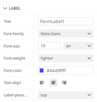
Code Sample:
<FormLabel
            sx={{
              'fontFamily': 'Noto-Sans',
              'fontWeight': 'lighter',
              'fontSize': '10px',
              'color': '#4449ffff',
              'textAlign': 'center'}}>Label1
</FormLabel>
13. Icon
This property helps you set up the start and end icons of the button with URL input and the disabled/enabled mode that you can tick on the checkbox.
Default
Checked
Indeterminate.
Properties Panel:
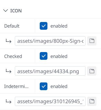
Code Sample:
 <Checkbox
                       icon={<img alt="Image" src={IconApproveIconSvg}/>}
                checkedIcon={<img alt="Image" src={IconA88a8cd82ccd942fe3593d73fc1fb8f7}/>}
          indeterminateIcon={<img alt="Image" src={Icon44334Copy1}/>}>
  </Checkbox>
Note: To access and import an icon from a computer or other sources via this property, you should:
Mark the checkbox to turn Enabled mode.
Select File-uploading Button to choose the Icon file from the Sources needed.
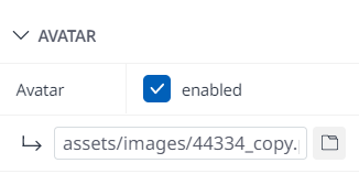
14. Avatar
In common, this property using for importing your Avatar on IDE.
Properties Panel:
Code Sample:
<CardHeader
        avatar={<img alt="Image" src={Icon800pxSignCheckIconCopy} />}>
</CardHeader>
Similarly, you can set the Avatar property in the same way as the Icon property in Properties Panel.
Mark the checkbox to turn the Enabled modes on
Select a file to upload from the button, then select OK
15. Link
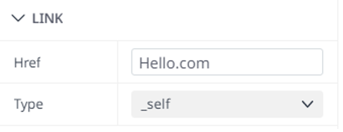
For this attribute, you would be able to enter the already made Href and the kinds of links you want to construct. If you use this property, create a Href and apply it to this input.
Additionally, it would be best if you made a plan to determine the types of connections and directions used.
Href
Type: _blank, _sefl, _parent, _top.
Properties Panel:
Code Sample:
<Fab href="Hello.com" target="_self" ></Fab>Depending on what the Type you choose, it will direct the Href based on this chosen Type
16. General
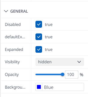
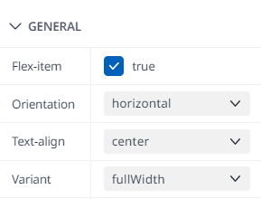
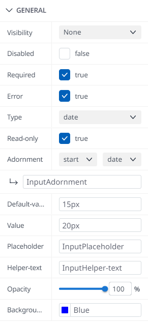
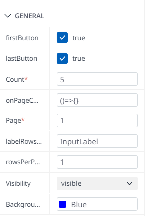
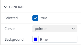
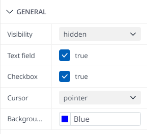
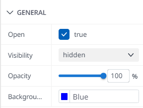
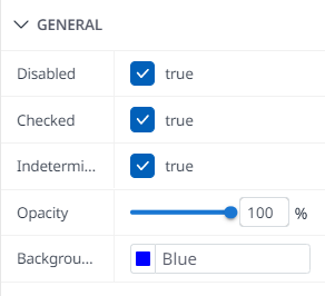
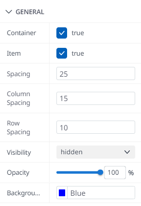
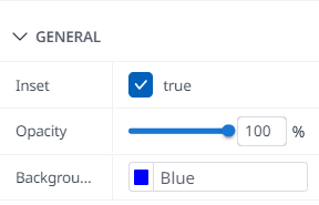
About this general property, the system will allow you to choose which types of visibility appear, such as Hidden or Visible. Besides, you can select Disabled modes, what kinds of cursors you use when hovering on the Button, Button Opacity or its background based on the available color board, and more. We will exemplify several properties below.
Disabled - DefaultExpanded - Expanded - Visibility - Opacity - Background:
Flex-Item - Orientation - Text-align - Variant:
Required - Error - Type - Adornment - Read-only - Default-value - Value - Placeholder - Helper-text:
FirstButton - LastButton - Count - OnPageChange - Page - labelRowsPerPage - RowsPerPage:
Sticky-header:
Selected - Cursor:
Text field - Checkbox:
Row:
Open:
Indeterminate - Checked:
Container - Item - Spacing - ColumnSpacing - RowSpacing:
Inset:
Placement:
We will eliminate the codes and properties defined by the above samples to understand properties better.
17. Advanced Style
You will be allowed to add more codes to the pre-existing principles based on Classname and Inline Style at the final stage of the process. Since you can instantly and spontaneously alter and upgrade code whenever necessary, you can find it immensely beneficial.
CLASSNAME
Based on the available code page and its class, you can be able to input CSS Class to set a wide range of layouts and CSS for the chosen component, which will help you add code directly to this input. Furthermore, all the CSS codes of the class would be pre-populated, so this class will help you customize your CSS layout and save time when applying a wide range of components.
You can add many class names in Properties Panel.
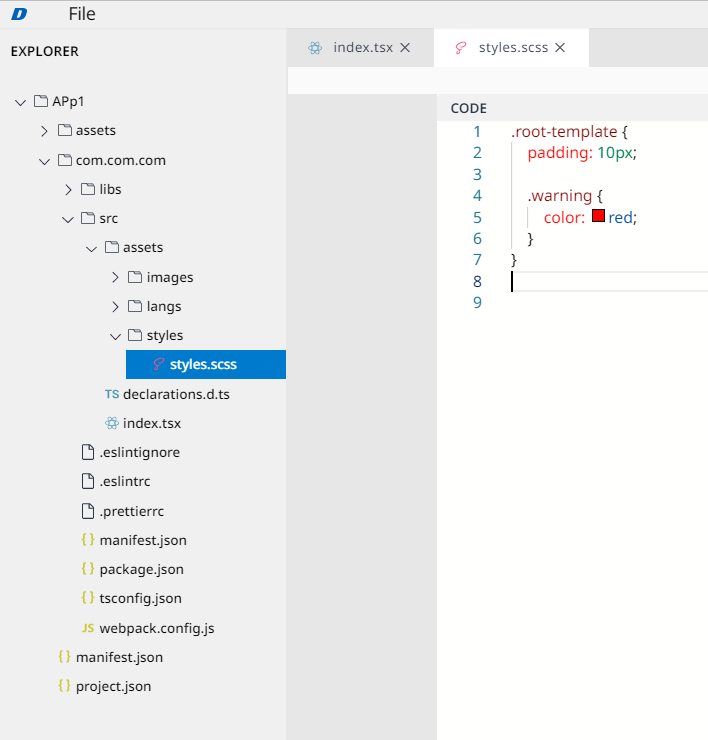
Define Classname:
At EXPLORER Panel, select Asset → Style
Select style.scss.
Define Classname and CSS Properies.
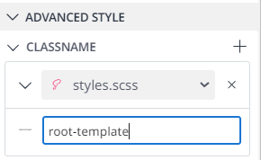
Apply Classname into Component:
Select [+] at the end of the Classname Property Panel.
Select CSS File containing CSS defined
Fill in Classname defined in that CSS File.
Remove Classname:
Select [-] at the left of chosen Classname box.
Cancel the adding progress:
Select [x] at the right of the Dropdown.
Code Sample:
<Button className={styles['root-template']}>Button</Button>INTENTION:
Classname always overwrites all the previously defined CSS Codes.
However, you should not build a similar attribute with different values on many boxes because the last box will overwrite all the previously defined boxes.
INLINED STYLE
To set the layout for the chosen component, you can enter input CSS. Not similar to Classname, Inlined Style allows you to fix and adjust your CSS codes immediately on the Properties Panel. All the things you do is fill in the CSS codes that you need to customize your chosen component, and these codes will override the CSS codes that were defined before.
Properties Panel:
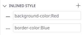
Code Sample:
 <Button
        style={{ 'background-color': 'Red', 'border-color': 'Blue' }}>Button
 </Button>
Style tag represents Inlined Style in Source Codes.
To create CSS in Inlined Style:
Select [+] at the end of Inlined Style Property.
Define CSS with your idea.
INTENTION:
All Inlined Style always overwrites previously defined properties.
However, you should not build a similar attribute with different values on many boxes because the last box will overwrite all the previously defined boxes.

