Radio
Overview
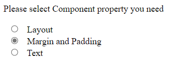
Radio is used to define the small circles, which are highlighted when selected. A radio button is one type of selection indicator in a list of options. The circle is filled if an option is chosen.

Please refer to this for more information: https://mui.com/material-ui/api/radio/.
Import
import { Radio } from '@mui/material';The above source will be imported automatically after dragging and dropping the Basic Component to the UI Preview Panel.
Property
Property:
Name | Default | Description |
Id-name | Placeholder: <id-name> | The Id-name of the created component. |
Default Style | Color: None | The component Default Style includes Color. |
State | State: Normal | The State of the created Component. |
Margin and Padding | Size Unit: Px | The component Margin and Padding with many selectable Size Units. |
Size | Size Unit: Px | The component Size includes Width and Height with many selectable Size Units. |
Layout | Position: None Size Unit: Px | The component Layout includes Position and Top - Right - Bottom - Left with many selectable Size Units. |
Text | Text: Menu Item Font-family: None Size Unit: Px Font-weight: None Text align: Left | The component Text includes Text, Font-family, Font-size, Font-weight, Size Unit, Font-color, Text-align. |
General | Disabled: False Checked: False Opacity: 100% | The component General includes Disabled, Checked, Opacity, and Background. |
Advanced Style | The component Advanced Style includes Classname and Inline Style addition. |
Code Sample:
<Radio
          color="primary"
          sx={{':hover': {'margin': '15px','padding': '15px',
              'width': '150px','height': '300px',
              'position': 'absolute','top': '15px','right': '15px','bottom': '15px','left': '15px',
              'opacity': 0.39,
              'backgroundColor': '#ff0000ff',},}}
          disabled={true}
          checked={true}>
  </Radio>