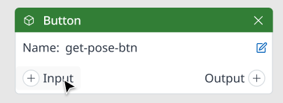
Basic Component Node
Basic Component is generated in Visual Scripting panel automatically when you drag and drop it into UI Preview. Besides, it helps you to select the needed input/output and connect them with other nodes.
Refer to this for further information: Node
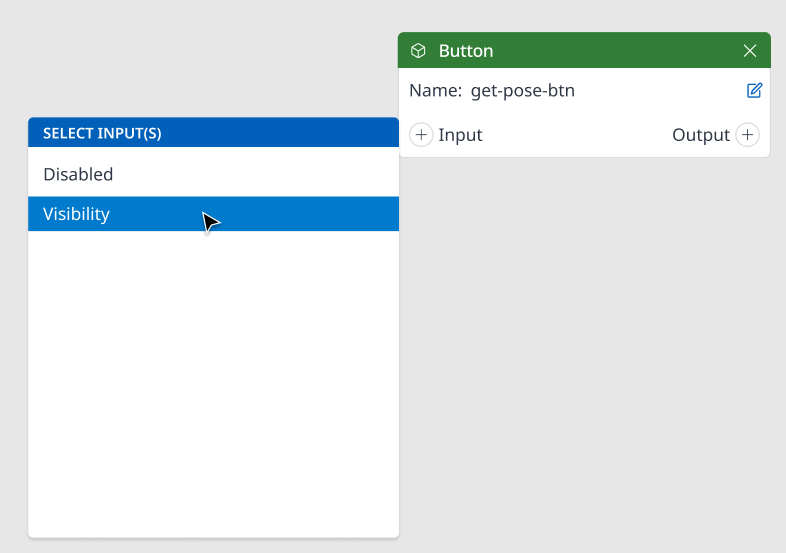
Add input to Basic Component Node
Step 1. Select
(+) Inputbutton.
Step 2. Choose type of need input.
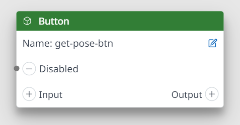
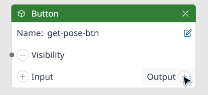
You can see the new input added to the input area.
Add output to Basic Component Node
Step 1. Select
(+) Outputbutton.
Step 2. Choose type of need input.
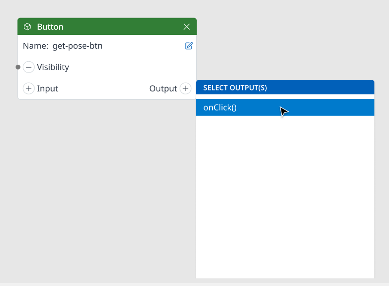
You can see the new output added to the output area.
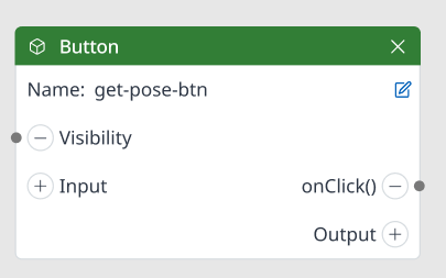
Input/Output Port Addition
Each Basic Component Node has its own input items and output items generated and selectable, which might be different with other Basic Component Node.
No. | BASIC COMPONENT | INPUT ITEM | OUTPUT ITEM |
|---|---|---|---|
1 | Accordion View |
|
|
2 | Alert | N/A |
|
3 | Button |
|
|
4 | Checkbox |
|
|
5 | CircularProgress | N/A |
|
6 | Dialog | N/A |
|
7 | Fab |
|
|
8 | LinearProgress |
|
|
9 | Radio |
|
|
10 | RadioGroup | N/A |
|
11 | Select | N/A |
|
12 | Slider |
|
|
13 | Snackbar | N/A |
|
14 | Switch |
|
|
15 | Tab |
|
|
16 | TextField |
|
|
17 | ToggleButton |
|
|
18 | ToggleButtonGroup |
|
|
19 | Tooltip | N/A |
|