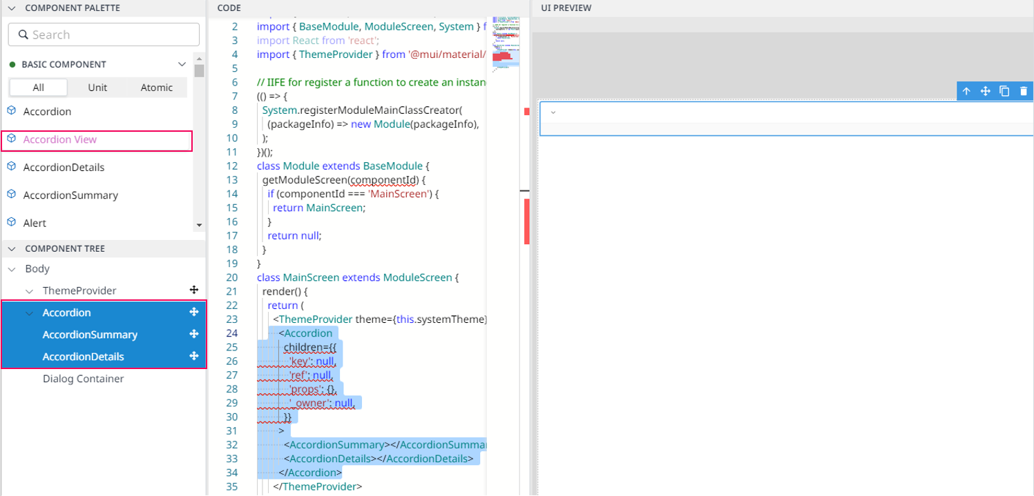
Accordion View
Overview
Accordion View allows you to create an expandable/ collapsible list - to show and hide information as needed. Accordion View consists of a series of titles such as Accordion, AccordionSummary, AccordionDetails, and when you click on a specific title, the detailed description will be expanded.

Import
import {Accordion,AccordionDetails,AccordionSummary,} from '@mui/material';The above source will be imported automatically after dragging and dropping the Basic Component to the UI Preview Panel.
Code Sample:
 <Accordion
    children={{'key': null,
               'ref': null,
               'props': {},
               '_owner': null,}}>
   <AccordionSummary
          sx={{'fontSize': '30px',
              'color': 'black',
              'textAlign': 'left',}}>Dart-IDE
     </AccordionSummary>
   <AccordionDetails
            sx={{'fontSize': '20px',}}>Overview
     </AccordionDetails>
 </Accordion>