Modal (Dialog)
Overview
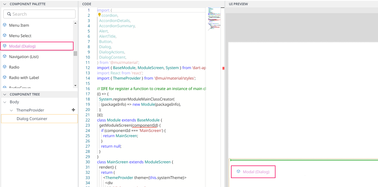
Modal (Dialog) is a dialogue (Dialog) that appears on top when the module is executed in Dart-Platform. This dialog disables the main content until the user explicitly interacts with the modal dialog.

Modal Component in UI PREVIEW
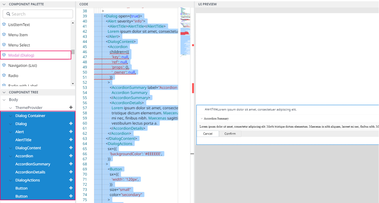
Modal (Dialog) contains :

Modal Component Sample in UI PREVIEW
Info.
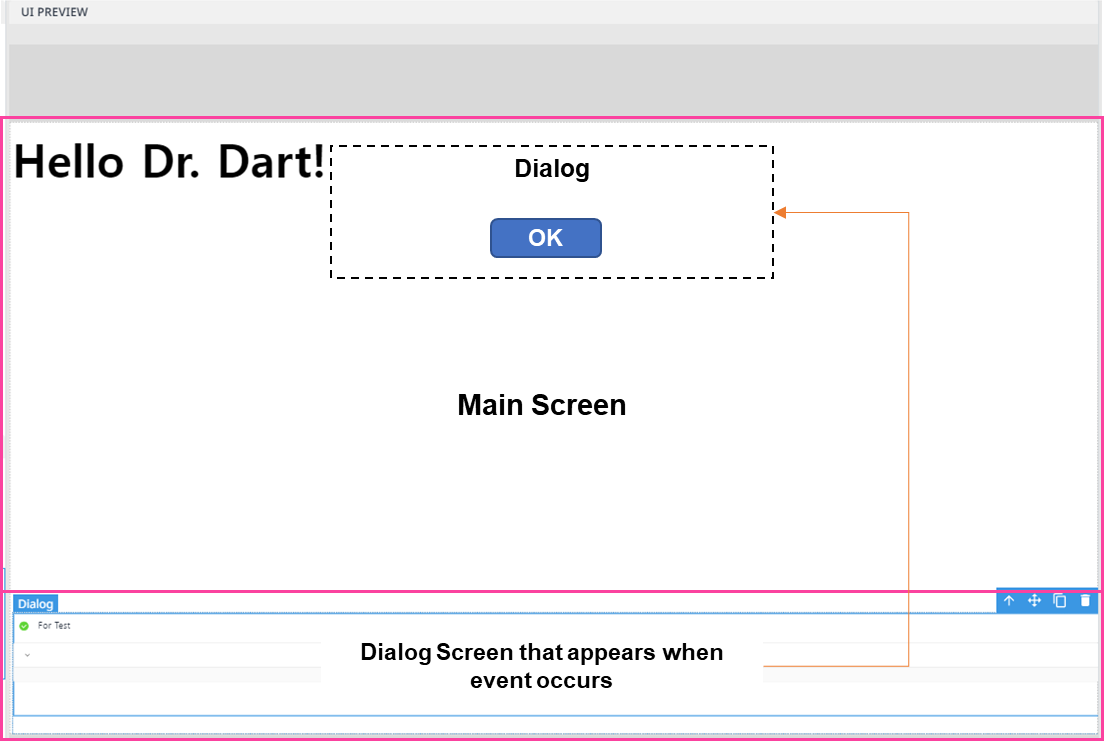
In UI Preview, the Dialog section is located on the bottom so that you should drag & drop Modal (Dialog) at the bottom of UI Preview. This is for the user-convenience, and when the module is actually executed in Dart-Platform, only the upper screen from the Dialog area is shown to the user. The Dialog area will appear when specific event that user set occurs.

Import
import {
  Accordion,
  AccordionDetails,
  AccordionSummary,
  Alert,
  AlertTitle,
  Button,
  Dialog,
  DialogActions,
  DialogContent,
} from '@mui/material';
The above source will be imported automatically after dragging and dropping the Basic Component to the UI Preview Panel.
Code Sample:
<Dialog open={true}>
      <Alert severity="info"
              sx={{'backgroundColor': 'brown','color': 'white',}}>
              <AlertTitle></AlertTitle>
              Verify your account
      </Alert>
      <DialogContent>
              <Accordion children={{
                  'key': null,
                  'ref': null,
                  'props': {},
                  '_owner': null,}}>
                  <AccordionSummary label="Accordion Summary">
                       Personal Information
                  </AccordionSummary>
                  <AccordionDetails>
                       Your phone number is 09035767xxx?
                  </AccordionDetails>
              </Accordion>
        </DialogContent>
            <DialogActions
              sx={{'backgroundColor': '#EEEEEE',}}>
              <Button
                sx={{
                  'width': '120px',
                  'backgroundColor': 'red',
                  'color': 'white',}}
                  size="small"
                  color="secondary">
                Cancel
              </Button>
              <Button sx={{'width': '120px',
                          'backgroundColor': 'green',
                          'color': 'white',}}
                           size="small">
                Confirm
              </Button>
            </DialogActions>
</Dialog>
