UI Preview
This section provides an overview of the UI Preview.
The UI Preview lets you quickly build layouts by dragging UI components into a Design View instead of writing in the Editor.
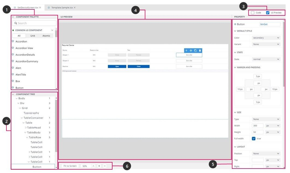
Component Palette: Contains various UI Components that you can drag into your layout.
Component Tree: This shows the hierarchy of components in your layout.
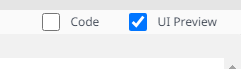
View Mode: View your layout in either Code Editor or UI Preview or simultaneously shows both the Code Editor and UI Preview.
Design View: Edit your layout in Design view and see it in Preview mode.
Property Panel: Allows you to edit properties of the selected component.
Zoom controls: Control the preview size and position within the Design view.
When you open a design file (tsx), Code Editor and UI Preview open by default. You can change the Editor by checking or unchecking from the View Mode.
Create a New Layout
Create a layout file (tsx) in your project's folder when adding a new layout for your module. You need to read the Add File first if you don't know how to make a new file from the Dart-IDE.
The UI Preview is available for the tsx file only and is always displayed by default when you open any tsx file. But make sure the UI Preview option on View Mode is selected.
View Mode
Find Components in the Component Palette.
You can find frequently used items in the Common UI Component category in the Dart-IDE.
At first, COMPONENT PALETTE and COMPONENT TREEare displayed as two closing dropdowns sticking together.
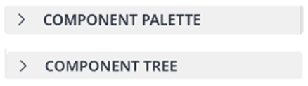
Note: After clicking on the two above dropdowns, it will display as the below images.
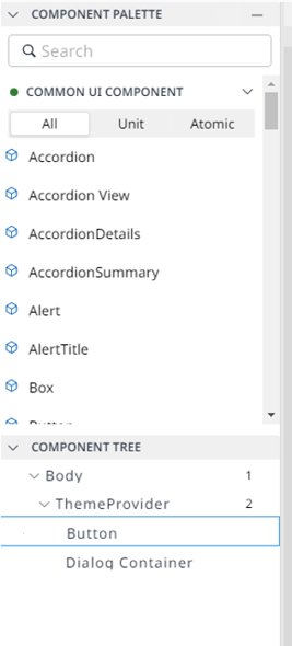
To search for a component by name in the COMPONENT PALETTE panel, you can enter the component's name into the Search box on the top of the Palette.
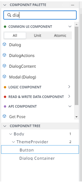
You can also search for other components from Component Palette, not only Common UI Component.
Add Components to Your Layout.
To start building your layout, you need to find and select a component from the COMPONENT PALETTE panel that you want to add to your layout first.

Drag a component from the COMPONENT PALETTE panel into the Design View.
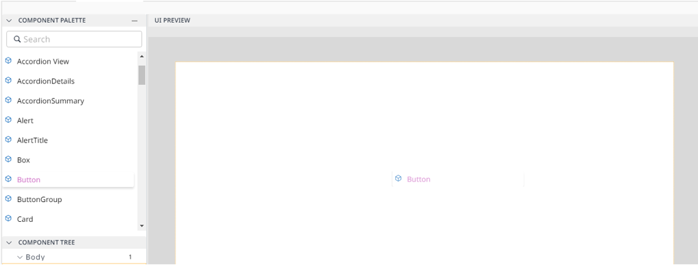
As you place a component in the layout, it will add that component to your layout, and the Design View will display a preview image.
The UI Preview will auto-synchronize your layout to the Code Editor.
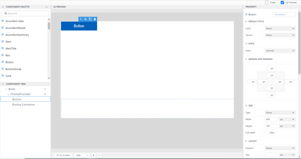
Edit Component Properties
You can edit component properties from the PROPERTY panel on the right side of the UI PREVIEW panel. This panel is available only when the UI Preview is open.
When you select a component by clicking the component in the Component Tree or the Design View, the PROPERTY panel shows the following.
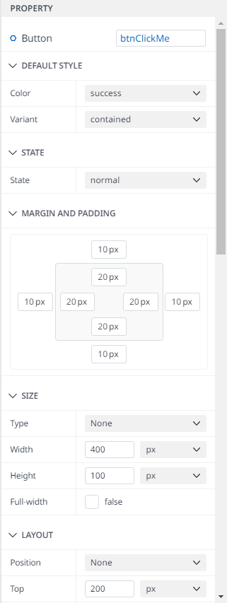
Property Panel
The UI Preview will validate and save automatically when you change a value. And then synchronize to the Code Editor.
Please read Basic Components or User Components to know the properties you can edit for each component.
Control the Preview Size
To control the preview size of the UI Preview, you can control the Zoom controls on the bottom-left of the panel.
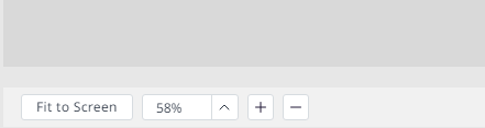
Zoom Controls
There are three ways to select: Fit to screen, choose from options, and zoom in/out by the [+]/[-] icon.
Control the Position Within the Design View
From the UI Preview, you can control the position within the Design View by pressing the [space] key during the drag of your layout.
When you press the [space] key, it will show the hand icon on the mouse position. If you keep the critical press, you can drag your layout.
Control the Components
You can select an item (or component) from your layout using UI Preview or Component Tree. It will show the Component control pop-up on the top-right of your selected item.
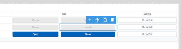
Component Control Pop-up
From left to right, there are some main features you can utilize:
Select Parent [↑]: Allow you to change the selection to the parent of the current item.
Move Item [+]: Allow you to move the current item to another position by hand.
Copy Item: Duplicate the current item and copy that item's properties automatically.
Delete Item: Remove the current item from your layout.
Cause of impossible to restore to the previous state, you need to be careful when doing any action.